December 31, 2006
2007: Reduce, Focus, and Filtering My Inputs
This is the first in a short series of things I'll likely write about the coming year (2007). The end of the year is often a good time to look back and think about what has happened and why, not to mention how they compared to my expectations and goals (assuming I had any).
Distraction and Productivity
In the last couple of years, my self-improvement efforts have centered around physical health. I've lost a bunch of weight and kept it off (see: Diet Tips or How To Lose Weight with a Spreadsheet and a Web Site, The Diet Plan and The Three Habits, The Diet Spreadsheet, Diet Tips: How To Eat Less), improved my eating habits, and am beginning to exercise more.
But my mental health has been slowly going down the crapper. While I've made half-hearted efforts to reduce the non-essential demands on my limited brain time and power (see: The Hopeless Email Battle, Shooting E-Mail Like Bullets, E-Mail Stress Disorder or Burnout?, E-Mail Tension Syndrome, E-Mail Newsletters and RSS, My 30 Day GMail and Yahoo! Mail Challenge), there's a lot more I can do.
I need to put the same amount of effort, time, and dedication into drastically reducing the "inputs" in my life, most of which are computer assisted and amplified. I need to reduce, focus, and filter my inputs.
Distraction Causes
In thinking about it, I've come to realize that there are surprisingly few underlying reasons for my mental distraction. Here they are:
- Longevity. As of a few days ago, I've been at Yahoo for seven years. I started in late December of 1999 and it's now late December of 2006. That means I've managed to get myself on a lot of mailing lists, many of which are "legacy" in the sense that I'm not involved with the stuff on a daily basis anymore, but I can't seem to convince myself to cut the cord. Similarly, I often get asked for my opinion on things that I only care about in a minor way (see next item) or that can be handled just as well (or better) by someone else.
- Difficulty saying "no!" For whatever reason, it's easy for me to over-commit and difficult for me to say "no" when I ought to. The strange thing is that I often know I'm doing it at the time (or shortly after) but can figure out how to correct the problem.
- Many Interests. I'm too interested in too many things. I always have been, so when someone passes me an interesting link or I stumble on a web site about some topic that I don't read about often enough, another 45 minutes can vanish in a flash.
- Availability of information. For someone of many interests, the web is a seductive technology. Information is so abundant and easy to come by that it rarely feels like "work" to dig it up. It's not like you have to travel to a library, navigate the bookshelves, and read without the aid of a search engine. So much of the friction is gone.
- Lack of obvious penalty. Unless I become more ruthless about setting goals (even simple ones) and somehow punishing myself for not meeting them, there's a lack of obvious penalty or downside to all this. That's not to say there aren't any but they're certainly not strong enough in most cases that I'm forced to change my habits.
What to do?
With all that in mind, I'm setting a few goals. Well, there're more like rules, but if I can stick with 'em, who really cares?
- I will unsubscribe from every email list that I don't consider essential to my work or hobbies. It's so easy to get occasionally interesting information when I need it (via search) that I shouldn't be spending mental energy reading a large stream of incoming hay on the off chance that a needle shows up.
- I will end every day (both at work and at home) with no open tabs in my browser. I've been using tabs as a sort of ad-hoc todo list that has no obvious order or priority and often spirals out of control. No more of that.
- While the echo chamber is fun, entertaining, seductive and often frustrating, I will check the various blog amplifiers and aggregators only once a day (barring unusual circumstances).
- I will try harder to say no.
There aren't many and they sound simple, but they represent pretty important changes to my daily workflow.
My goal is to spend more time on quality stuff: getting deeper into stuff that I already do and want to do more of, building more stuff (more on that later), and spending less time on trivia, and generally trying to have a clearer head and less of a sense of urgency.
Do you have any distraction reduction plans in the works too?
December 28, 2006
Dark Chocolate Honeycomb Sponge from the Death Valley Nut & Candy Store
One of the few benefits of spending a few nights in Beatty, Nevada (not far from Death Valley) is that the Death Valley Nut & Candy Store was a 2 minute walk from our motel.
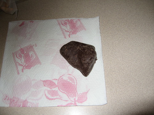
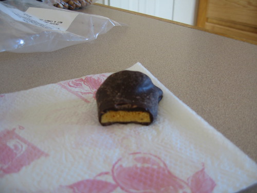
We wandered their isles the other night looking for what to buy. I found a good assortment of sugar infused gluttony and ended up buying a few bags. The only bag I bought without prior experience was the Dark Chocolate Honeycomb Sponge candy, pictured below. (Strangely, Amazon sells Sponge Taffy Boxed Chocolates which looks similar.)
But the outside is a bit deceiving. Inside is the "honeycomb" which is really like a styrofoam compound infused with the flavor of a weak butterfinger candy bar (peanut butter and a hint of butterscotch).
In other words, yummy. :-)
Too bad the whole bag is gone already... But there are still Orange Slices and Now & Laters left.
December 27, 2006
Christmas in Death Valley
Like everyone, I've fantasized for years about spending Christmas in Death Valley. This year, the dream finally came true. I spent a day and a half with several other units of the Zawodny clan wandering the vast expanse of desert and superficial lifelessness.
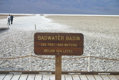
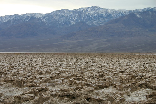
Above: Badwater Salt Flats (the picture everyone takes)
Badwater is a basin in California's Death Valley, noted as the lowest point in North America, with an elevation of 282 feet (86 m) below sea level.
The site itself consists of a small spring-fed pool of water next to the road; however, the accumulated salts of the surrounding basin make it undrinkable, thus the name "Badwater". The pool does have animal and plant life, including pickleweed, aquatic insects, and the Badwater Snail.
The pool is not actually the lowest point of the basin, which is several miles to the west and varies in position. However, the salt flats are hazardous to traverse (in many cases being only a thin white crust over mud), and so the sign is at the pool.
Source: Badwater on Wikipedia
Often difficult to access through the paved road which closes after the rains, the Devil's Golf Course is a huge area of land comprising of rock salt. Located in Death Valley, California, this amazingly jagged, serrated and spired region would inspire no one but the Devil to play on its rough terrain. Erosions due to wind and rain have largely been the cause for the rather intimidating topography of Death Valley.
Source: Devil's Golf Course on Wikipedia

Above: Ghosts (from the nearby Ghost Town of Rhyolite)
Rhyolite is located 4 miles west of the town of Beatty, Nevada on HWY 374. The East entrance to Death Valley, Rhyolite offers photographers, explorers and ghost town enthusiasts an enjoyable experience. For those of you who cannot visit the town we have a tour on line. For those of you that will be visiting the town, I suggest you download and print the tour before you go. There is no information available at the ghost town. If you have been to Rhyolite, or plan on coming take the tour anyway and enjoy. Don't forget to go to the sitemap. There are some places you can not get to from here. After all, it is a ghost town.
Source: RhyoliteSite.com
I would have liked clearer skies for my pictures, but that just means I'll have to come back sometime. :-)
More pictures to come. I've taken hundreds and hundreds of pictures so far on this little vacation.
Sorry For The Downtime
A cable to my server got unplugged and the wrong one was plugged back in. I hate it when that happens--always when I'm traveling.
Anyway, I'll be moving servers in a few weeks, but things should be normal until then.
December 25, 2006
San Diego Wild Animal Park
Unlike the world famous San Diego Zoo, the San Diego Wild Animal Park is (a) not in San Diego and (b) very big and open. Located in the town of Escondido, about 30 minutes northeast of San Diego, the Wild Animal Park (WAP) contains a lot of open space in which animals from around the world and live in environments more like their native habitat (at least when compared to a typical zoo cage.
The pictures above were shot from the free 45 minute train ride that takes you to areas of the park that are not accessible on foot. While we only spent a few hours there yesterday, one could easily enjoy a full day visiting all the critters.
I'll post more pics on Flickr in a few days.
December 24, 2006
USS Midway (CV-41): The San Diego Aircraft Carrier Museum
The USS Midway, America's longest serving aircraft carrier is now a permanent museum based in downtown San Diego.
Admission is $15 for adults and includes an audio tour option (you get a set of headphones to use). One can easily spend half the day touring various levels of the ship to see officer's quarters, medical facilities, numerous aircraft (both on and below deck), and other artifacts.
There's a gift shop and small café on board as well.
December 23, 2006
Five Things About Me
Given that I've been tagged by at least three people in the last week or so (Mark most recently), I guess it's my turn to pile on to the latest meme. So here are five things you probably didn't know about me unless you happen to be my family.
- I almost went to Space Camp back in 1988 or so. I'm now jealous that Ryan got to go. I ended up trading my space camp trip for a hard disk and hard disk controller for my Amiga 500.
- Funny pet names. For whatever reason, I've always had pets with amusing names. Our first cat was named "kitty" (as noted earlier). We also had a few guinea pigs: Freddy and Boo Boo. I currently have two cats: Barnes and Noble.
- When deciding where to go for college, I was torn between Aviation and Computer Science. So instead of picking a school that had an excellent program in one or the other, I picked one that had mediocre programs in both. But I never changed my mind and graduated with a CS degree. Luckily that eventually provided enough income that I can afford to fly for fun.
- The longest I've dated anyone is just over five years. That was quite some time ago, too.
- I am lactose intolerant.
I guess I need to tag a few people now, but I'm not sure who has or has not been tagged. So here we go: Dylan Tweney, Greg Linden, Phil Windley, Brad Fitzpatrick, and Marc Abramowitz.
December 22, 2006
Air Force One at the Ronald Reagan Presidential Museum
The Air Force One Pavilion at the Ronald Reagan Presidential Foundation's Museum and Library is worth the drive to Simi Valley California even if you don't care about the Reagan presidency.
If you do care about the Regan presidency, however, the rest of the museum is a real treat too. There are hundreds of interesting artifacts on display (from the hundreds of thousands collected during his 8 years in the oval office).
Speaking of the Oval Office, they even have a nice replica of that famous room on-site.
I'll post way more pictures when I'm not uploading to Flickr from an EVDO connection.
December 20, 2006
No, it's not a Pony
It's a miniature horse (one of many) that lives at the Quicksilver Ranch in the village of Solvang ("the Danish Capital of America"), which is located in the beautiful Santa Ynez Valley of California.
Visiting the Quicksilver Ranch costs nothing, which is rather surprising in the tourist trap that Solvang is. More on Solvang in Wikipedia.
And, in case you're wondering, glider rides in Santa Ynez are available from Windhaven Glider Rides.
In [not] related news, I'm on Twitter, since I was apparently quite far out of the loop until now.
December 18, 2006
Playing Tourist For A Few Days
The parental units are in town, so I'm not reading blogs, checking email much, and so on. We're playing tourist.
Therefore I leave you with a picture of a wodden prop and the expetaction of slow replies to most emails. Slower than normal.
Have a good holiday or two.
December 12, 2006
Best Mashup Ever: Caffeinated Viagra Beer
Imagine a mashup that anyone can relate to--even the sort of person who uses a computer vary rarely, spending more time on... watching NASCAR or playing catch with the kids or whatever it is that non-geeks do.
During a discussion at work today (before I hopped on a plane to visit Microsoft), we somehow got on the topic of beer and erectile dysfunction after initially starting on advertising sales. I kid you not. The conversation just got more amusing from there:
Person A: "Maybe the ED is caused by too much alcohol..."
Person B: "What we need is caffeinated beer."
Person C: "And we could add Viagra to it!"
Person D: "It'd be a mashup."
That's right. Caffeinated Viagra Beer.
It was at that point we realized that this might be the best way to explain to the larger population (at least the over 40, beer drinking, male population--and their occasionally frustrated partners) what a mashup is using a relevant example.
[Names and roles of those in the conversation have been changed to protect the guilty and/or ... dysfunctional. :-)]
December 11, 2006
Google Blatantly Copies Yahoo!?
I'm not sure if this is stupidity, laziness, or a mix of both, but check this out.
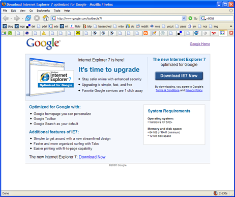
Back when IE7 launched, Yahoo! created a customized version and began to market it to our existing IE users. The "splash page" looked like this:
Today it seems that Google has similar intentions. So similar, that they decided to basically copy our page and slightly Googlify it. If you look, the design, layout, and most of the text are the same!
WTF is that about?
Was some product marketing person so uninspired that he or she decided it was "good enough" to just copy us?
Seriously, click those images and look at the full-sized versions. They're remarkably similar. And I've checked with our PR group to make sure that this wasn't just a template that Microsoft gave to all partners. It's not.
Yikes. Even the toolbar in the Google version of the picture has bits of Yahoo still in it.
Update (10:45pm): Google appears to have updated the page so that it looks far less like Yahoo's page now.
December 07, 2006
Drunk Airline Pilot Sketch Video
It's been a while since I posted any flying related YouTube videos, so here's a dose of humor. I have no idea when this originally aired, but it's hard to watch and no laugh out loud.
See what I mean?
December 05, 2006
The Prayer of Silicon Valley
A little while ago one of my coworkers alerted me to the fact that news vans were showing up on campus. (I'm at our Mission College office right now, just a few miles away.) Then he pointed me at Rumor: Yahoo executive powwow after market closes and Yahoo Execs Meeting To Discuss Major Shakeup.
And, as you might expect, the internal rumor mill was already in full swing.
At one point in the IM conversation, shortly after I suggested that Britney Spears should be our new CEO (since she's so popular here anyway), I wrote the following:
Maybe this will make wall street happy and our stock will rocket up before we all have to find new jobs...
Being a quick-witted one, he wrote back: that should be codified as the "Prayer of Silicon Valley"
Sounds good to me.
December 03, 2006
Citabria Checkride Practice Maneuvers
 After my last flying adventures, in which I got way more comfortable with my short field landings, I hit the sky again today with an agenda in hand.
You see, on Friday I flew with my instructor again and have now received my final signoff for the FAA check ride.
Woohoo! That means it's final practice and cramming time!
On the agenda today was:
- Slow Flight. My goal was to fly along at 50mph, make a few 180 and 360 degree turns, and do so without gaining or losing more than 100 feet.
- Power/Pitch Coordination. I wanted to decelerate from 110 mph to 50 mph without gaining or losing more than 100 feet and then accelerate back to 110 mph.
- Perform at least 2 good soft field landings and takeoffs.
- Make three short field landings and takeoffs.
- Simulate two engine failures while in the pattern and land at a reasonable place on the runway.
- And, just for good measure, one good wheel landing.
The pattern at South County Airport wasn't too crowded and things went quite well. The only negative thing I can say is that my wheel landing wasn't quite "good", but that's okay. Wheel landings are not an exam requirement anyway. There will always be time to practice more. :-)
As a bonus, I even located the electrical problem that's been causing our transponder to work on an intermittent basis. (I used the "whack the electrical panel with fist method...") It's not fixed in a permanent way yet, but at least we know where to look.
If only the oil leak was as easy to track down...
Don't Fuck With Simple
Especially when "simple" is synonymous with "useful".
Alternative title for this post: Let Users Preview Changes!
If you haven't been following the uproar, Yahoo! TV recently released a new design without offering up a beta test or preview (like we did with Yahoo! Mail) and the on-line reactions have been resoundingly negative, as far as I can tell.
Here's a sampling:
On TechCrunch:
Yahoo took a beating by users angry over the new Yahoo TV product in the comments to their own blog post announcing it. Even a former head of Yahoo Entertainment, Erik Schwartz, chimed in with his own bashing and suggesting that Yahoo has lost its way.
On 0xDECAFBAD, Les says:
Okay, Im sick of it now, like many others. I was dazzled by the AJAX pagination technique at first, because I think its an interesting advance in AJAX in general. But, Ive been a user of the Yahoo! TV Grid - er Listings - for years now. Its useless to me now, even after I re-discovered its location after my bookmark broke. I hate to be harsh, but Id outsourced a part of my brain the Yahoo! TV Grid, and suddenly that part of my brain is damaged.
On Derek's Rantings and Musings, Derek says:
But, like all things Yahoo that don't completely suck, they're not content if they're not ruining it, so some product designers got their hands on it, and now if you go there, you will get "Yahoo!TV Beta". Unlike with Yahoo!Mail and others, though, there's no way to say "Let me continue to use the non-suck-ass interface as long as possible please."
On Yahoo's Corporate Blog, many in the comments are ripping it apart too...
Debra says:
This is simple stuff. Dont make it so complicated, or Ill wade through all the junk on www.tvguide.com.
Eric says:
I cant believe that you are now forcing an inconvenient signin to view localized listings! What a cheap, worthless stunt! You had a near-optimal experience lined up before, where apparently cookies kept track of where a user was and what their TV service was.
Youve blown it now, idiots. Continue to force a signon for this and Yahoo! will lose not only my eyeballs on the listings page (there are several free and convenient alternatives, you know) but you will also see me reset my home page away from where its been for 5 years. I havent liked the way youve progressively cluttered the Yahoo! home page, but Ive put up with it.
Chrevnir says:
I had to search to find this place to provide feedback, it took me 20 minutes of hard searching to find any place where I could share my horror at the travesty done to the TV listings. Please provide a link on the page when you make such draconian changes with no warning. It would lessen the blood pressure of your customers greatly.
And it goes on for quite a while, including comments from folks involved in building (or destroying?) the product.
In other words, this may be the best example so far of the Yahoo! corporate blog actually working. It's facilitating a two-way discussion about something that's very important to our users in nearly real-time.
It's a good thing we allow comments there. :-)
Back to the redesign...
This all leaves me wondering a bit. Like you, I'm trying to figure out how this could have happened. Why was there no trial period so that die-hard tv.yahoo.com users could voice their opinions before being forced to use the "improved" interface? Why did we manage to toss both "simple" and "useful" aside and substitute "flashy" for them?
I don't know the answers to any of those questions. Heck, I had sort of forgotten that tv.yahoo.com existed, because I don't watch TV. But when I did, I used it all the time. And I definitely remember it being the sort of "get in, get your info, get out fast" sites that you end up being very loyal to.
A small part of me wonders if this will be fixed sooner now that so much of the complaining is right in public on the corporate blog. I'm even starting to wonder if it's possible to close the feedback loop even more tightly by integrating comments onto new products themselves...
