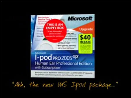
That's exactly what this video illustrates.
Starting with the standard Apple iPod packaging, it walks you thru the process of "Microsoftizing" the packaging an marketing language.
Funny stuff, mostly because it's true. :-)
Posted by jzawodn at March 01, 2006 12:58 PM | edit
God it is so true. If I have a $ for every time I've seen Marketing pull the "We need to make better used of the space" which turneds into a confusing busy layout, which turns into "that page is too busy, we need to make it more simple"...
I'd be richers than Billy G.
Heh, looks a lot like Yahoo's main page (as opposed to Google's Apple-esque main page).
Made even funnier by Mr. Scoble's admission that the video was produced by microsoft marketing for an internal meeting.
Going back to the original post on Channel9, I did nod my head in agreement with Karim's comment.
This may also interest you:
http://www.microsoftmonitor.com/archives/014066.html
The original video link no longer works. Does anyone know of one that's still up?
Urgh, that was probably my fault.
Working link (hopefully): http://www.youtube.com/watch?v=aeXAcwriid0
I think it shows how MS folks can laugh at themselves. But, as someone in the creative side of things, I can attest that the pressures to "microsoftize" content (as you suggest) is universal. To be fair to MS, their packages are better than most I've seen, on the drawing boards and on shelves. For instance, Xbox360 (http://www.xbox.com/en-US/hardware/xbox360/xbox360customize.htm), Expression (http://www.microsoft.com/products/expression/en/default.mspx) and Visual Studio (http://msdn.microsoft.com/vstudio/products/) all from this year or last.
Sorry, don't mean to spam but the links above got messed up. These should work:
http://www.xbox.com/en-US/hardware/xbox360/xbox360customize.htm
http://www.microsoft.com/products/expression/en/default.mspx

