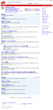
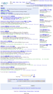
Before heading off to SES New York (I still need to pack), I took a minute to try out the new Ask.com (formerly Ask Jeeves):
And noticed some striking similarities to Google:
Common colors for sponsored links (though the ones on Ask.com don't "work" if you click in the bluespace that has no text under it), navigation at the top and bottom, color bar, and so on.
Heh.
Posted by jzawodn at February 27, 2006 11:09 AM | edit
Well, Jeeves went retainment and ask left empty.
to be honest I gave yahoo try with search, changed firefox default engine for a while but several things happened that pissed me off so I switched back. The worst thing is I used on many advanced features to type directly in google textbox, yahoo have similar but different syntax, going advanced I have lost my selections.
for example query: Jeremy "is this OK" site:yahoo.com
got some results click advanced get form click search in my text box there is no site:yahoo.com
Once I made typo in domain name on advanced form and could not fix it on results page because there was no text site:
Switching advanced and text mode at Yahoo sucks. I do not want to flame you. fix your search forms and make data flow consistent.
Speaking of blue color schemes and search engines, what is up with msn switching to the silver from the blue?
It must be said, Yahoo!'s search results also look Very similar to Googles.
there are actually fewer ads on ask now than google or yahoo - nice. also i think its on the homepage where the key differences are.
WHY IS GOOGLE GETTING WHIPPED IN SOUTH KOREA BY NHN?
http://bernardmoon.blogspot.com/2006/02/why-is-google-getting-whipped-in-south_01.html
Korea is the future, right?
Dude...the LOGO is very different!?!
In one of our log sets I see ASK rising conspicuously fast... I'm wondering if Jeeves may have been holding them back!
Yahoo and Google results are very comparable but the buzz still says "Google rules". Odd.
You'll notice Yahoo's results are laid out similarly as well. Only MSN was brave enough to put results in a slightly different shade of blue.... oohhh.. Don't consider Aol.com's visually different results which, of course, are Google.com results with a different style sheet.
You, if anyone should know that Search engines were forced into this decision by the whim of searchers after mom and dad started to associate Google with the Internet. If they started to see search results that weren't in Blue and Green, they thought they were on the "wrong Internet".
Dear webmaster,
My name is andy. And i am from china. I find your blog from google.com. And deeply impressed by your space and words, So I am very happy to exchange website link with you. our oil painting website info is as follows:
Title:wholesale oil painting from China
Website: http://www.jandm.cn
Logo: http://www.jandm.cn/images/logo2.gif
Description:J&M artwork offers beautiful oil paintings artwork and frames. Flattest price and museum quality. 100% hand made and 100% payback guarantee.
If you would like to exchange your link with us. Please contact me and give me your site info.We will add yours soon.Thanks a lot.
My msn is xmbeckham#hotmail.com (change # into @)
email: jandm58@gmail.com (change # into @)
Wierd that you noticed the new ASK resembles Google. Barry Diller made a point this morning to stand apart from Google, to "be evil", so to speak.
I'm reporting on SES for Know More Media this week and posted a long rant about Diller's speach this Monday morning http://www.webmetricsguru.com/2006/02/askcoms_new_mottobe_evil.html
If you come to think of it, Google is aping Yahoo outright. They are trying to be a portal like Yahoo. Google has copied Yahoo's email service, Messenger Service, News service, Map service, Local, Yahoo MyWeb (90% of Google's products ape Yahoo and 10% of Yahoo's products ape Google). Google is merely learning from Yahoo's mistakes to roll out a better product. And of course Yahoo would try to find loopholes in Google's products, and try to better their own.
Yahoo is trying to be a search engine, and Google is trying to be a portal :))
Ask has a lot of potential now with its new business strategy.
Its something for folks to keep an eye on.
I don't think we've heard the last of Ask by a long shot.
Google has its interface spot on.
Yahoo has retro search options, which make their showcase "busy" and more cluttered to add confusion to the consumer.
Ask is closer to Google than Yahoo is to Google.
Let folks know the dust that had settled on Ask has been blown off and whats underneth is attractive, shiny, glittery and all things new.
People had forgot about Ask.
Its time to Ask users to give this antique another go.
They were right to get rid of the butler.
It makes sense, Ask is making more sense than it used too.
Yahoo Google need to be aware.
I eamn which one would you use?
or
I think the answer is clear.
I mean the news headlines, the mail login, the market quotes... ALL clutter.
Then goto Yahoo's results page,
You've got all sorts of text above and below the results promoting the retro search products that no one gives a smeg about when all they want is to book a train, hotel etc.
Sigh >.<
How come a lot of the Ask.com sponsored links are links to google.com somehow... Not all of them but most of them... Copy the link and see if it starts with google... I searched USB Hub and they are links to Ask.com but if you search USB (No Hub) they are linked to Google.com...
I have never used ask .com since they dropped Jeeves get him back


